
The screen you see on the Chaos Clinic contains a lot of information. This page explains what you are looking at.
The screen is generated by my Chaos Trader-RT program. I wrote this program myself so I could get the display I needed to see what was really happening in the market. The screen is created by a display script, which I can change to change what I see. What is explained here is a typical screen for a Chaos Clinic.
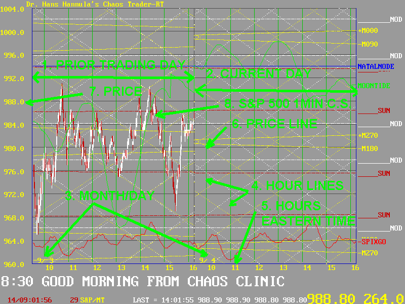
The screen shows two trading days, shown by 1 and 2 in the above figure. The dates are show in yellow in the lower left corner of each day's chart, as per 3. Vertical green lines mark the hours (4), which are labeled in 24 hour US Eastern Time (5). Black price lines mark major price levels (6) with prices being labeled in yellow on the left side of the screen (7). Prices for the current S&P 500 futures contract are shown with red and white one minute candle sticks, as shown at 8. These candle sticks are white during a rally and red during a decline. A small yellow line on the right end of the price curve shows the current price level. This is also shown in big numbers in the lower right corner of the screen. The price shown here is 988.80. The number after the price is the current degree postion of prices on the ephemeris wheel.
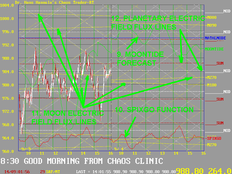
The MoonTide forecast line is the green curve shown at 9. This is the tide in the earth's electric field caused by the moon, as tuned into by the S&P. It has a major influence on the emotions of traders, and thus on price. It is labeled to the right, normally as +MoonTide. If the label says something like Tide+20, the MoonTide has been shifted 20 minutes to the right. if the line is red and the label says something like -Tide-120 or -MoonTide, it is the inverted tide.
The SPIXGO function is an energy wave formed by the rotating earth. It may be displayed as at 10. Green is the + wave, red the minus wave. It is most useful when markets go flat. It is less important than the MoonTide, but often gives useful information.
The MoonTides are dynamic, rapidly changing. The Moon also establishes fairly static electric field flux lines, which change day to day, but are pretty stable during a day. They form major price support and resistance levels. They are shown in yellow as per 11. They have lables on the right edge of the screen, such as just Moon, or more detailed ones like +M090.
There are also electric field waves due to each planet. These too are pretty static. These may be shown in any color, and are labeled to the right. Point 12 in the figure above shows a red SUN line and a white NODE line. These are turned on and off depending on their importance to that day's action.
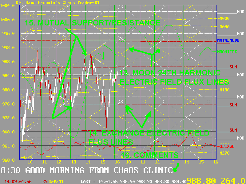
All these elctric field flus lines PRE-EXIST. They are eternal. They are not trendlines drawn on prices. Rather, they are the invisible forces to which prices respond. They form the "wallpaper" on which prices are painted. Two very useful ones are the ones formed by the Exchange as it rotates, and the 24th harmonic of the Moon. These are shown for the Moon by yellow lines at about 30 degrees as at 13, and white lines for the Exchange, as at 14. On days when they come into synchronization, they form strong support and resistance lines, as shown by 15.
Finally, the Chaos Clinic comments are shown in white at the bottom of the screen, as per 16. These are updated every 10 to 20 minutes, so to see them all you must periodically refresh your screen.
Occasionally, you may see some additional indicators. Two I use a lot are the Jude Jr. Trading system and the QPFE.
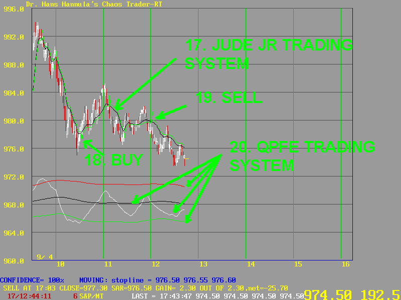
Jude Jr. is a "fractal moving average" (FMA) based trend following system. It shows up as a black line, which is the FMA, and a green stop and reverse line. These are shown at 17. The stop and reverse line has little offsets inserted in it to show signals. This are the little "pips" shown at 18 and 19. They are supposed to look like the shaft of an arrow pointing up for the buy and down for the sell.
The QPFE is Quick Polarized Fractal Efficiency. It is shown by 4 lines, as at 20. The white line is the QPFE proper. It measures the efficiency with which price is moving up or down. Bands are placed about it by adding an average black line, a statistically high red line, and a statistically low green line. Extremes in efficiency go outside the green and red lines, warning of a move climax.
![]()
![]()