
The Chaos Map
![]()
![]()
![]()
![]()
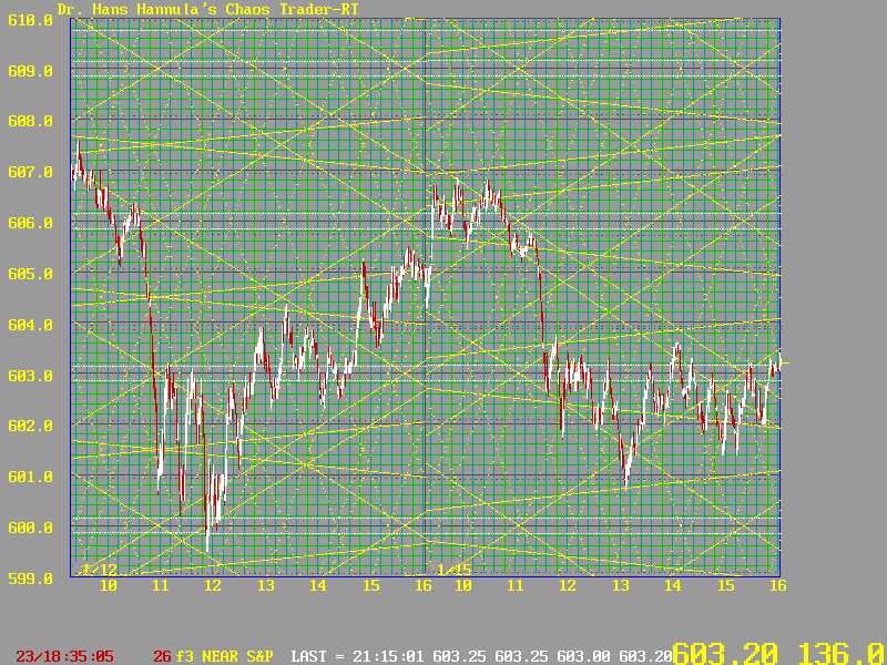
In this larger view, you are looking at a full screen from my online trading system, which is an MS-DOS program. It is now being redesigned as a Windows 95 application. Here you will notice 3 different slopes of yellow flux lines, or energy beams:
Prices are in red for down candle sticks, white for up candelsticks. The scale is on the right. A move from 602 to 603 represents a $500 change in the value of one S&P 500 futures contract.
The time is along the bottom in 24 hour Eastern time. The dates shown are January 12 and 15th, 1996.
Notice how prices congested in a triangle pattern from 9:30 to nearly 11:00 on the 12th. The triangle is approximately bounded by the yellow lines going up from 605 and down from 607. Then notice where these lines crossed a sharp chaotic move occurred down to the 601 area. That is chaos.
Look closely at the steep, dotted yellow lines. See how prices try to move along these
lines?
Notice how the upcoming pair of yellow lines turned prices up for the rest of the day.
Notice on January 15th how prices again congested in a triangle early in the day. This triangle represents a chaos balance point. Fast, profitable moves come on the breakout from such balance points.
Again notice how a chaotic move occurred at the end of this triangle, near 11:40. Notice the pair of close down yellow 30 degree lines that forced prices down.
Notice how the morning decline bottomed exactly on a 10 degree line at 13:22.
These lines are waves, or energy beams, in the tachyon field. Knowing where these lines are helps a trader anticipate what prices may do next.
The Chaos Map is featured on our Tomorrow's Market Faxout, and is a feature of our Chaos Trading System (when released). The computation of The Chaos Map is taught in my Master's Course.
Now, here is another Chaos Map for January 16, 1996, showing prices moving first
down, then up between two energy beams. That move was worth over $5000!
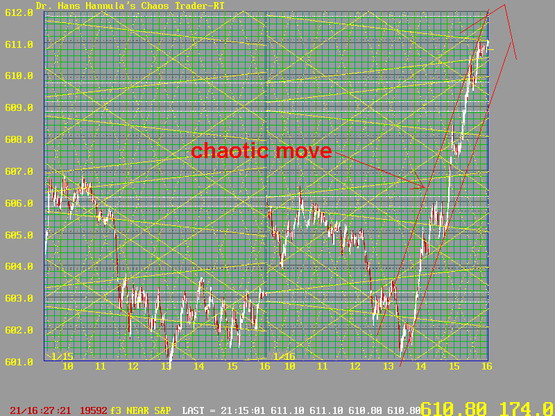
Using the Chaos Map, I bought at 602.50, just above the 10 degree down sloping yellow line. Notice how prices made the 13:36 low down a 70 degree line, touched the down going 30 degree line, and then started to rally. That told me that if prices moved above the 10 degree line, they could move up for the rest of the day. They sure did. Unfortunately, I had to leave and covered at 604.40, where the two 30 degree yellow lines cross. But still, that one move of prices through the Chaos Map was good for $950. Yes, you can Cash In On Chaos!
If you are interested in leasing or purchasing The Chaos Trader software when it is finished, let me know of your interest. You can Send Email or fill out the comments section of our order form or free newsletter request form.
![]()
![]()