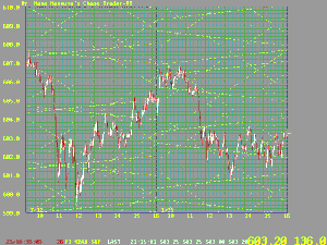

One of the results of our research as been the discovery that prices of stocks and commodities move in an energy field. Theoretical analysis has given us the ability to compute the "lines of force" of this energy field. Prices tend to move along these "flux" lines, or be attracted or repelled by them. Examine the chart of two days of S&P500 prices shown below. Prices are in the red and white one-minute candle sticks. The energy fluxlines are in yellow.

You may want to see a larger version of this chart. Click here for larger chart and more detail.